Oh my gosh! It's been almost a month since I posted anything! Well, I'm going to make up for it now. I wanted to show you pictures of my school and some of my artwork. Tomorrow I start working on a computer, which will be so nice. Doing everything by hand was so time consuming. I know some of you really wanted to see some of my artwork, so I took photos of my artwork that's hanging in the halls of my school. I'd love to hear what you think! You don't have to be a Blogger member to leave comments. Just click on anonymous and make sure you leave your name so I know who it was from!
This is Ceelee, one of my teachers. She was my teacher for almost all of my art foundation classes. Her class was always very funny and interesting. We'd get into discussions about how the packaging on a wine label would influence purchasers, and you'd be surprised how some of my classmates have very far out there ideas. It was always entertaining. Ceelee always helped me to take my projects one step further and make them better. I know she also enjoyed having me in her classes because I was level headed, my projects were always turned in on time (something other students could not get the concept of!) and my projects were always done to the best of my ability. I received A's in all of Ceelee's class which were: Typography, Introduction of Design Principles and Color Theory, Applications of Design Principles and Color Theory and Advertising. I really loved having Ceelee as one of my first teachers.
This is the room where I spent the first eight months of my college education in. Lot and lots of hours spent drawing in this room!
This was my last project in Application of Design Principles and Color Theory. We had to create a Behr paint brochure that you would see in Home Depot. We had to come up with a theme and color schemes, then apply them in three rooms. Even though I'm not into Feng Shui, I wanted to create color schemes that represent earth, water and fire and then use them in a living room, bathroom and bedroom. This brochure was all hand drawn. Lots of hours went into this project, and I love how it turned out.
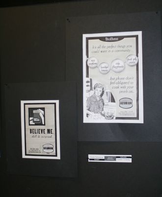
Our first project in Advertising was to create two black and white newspaper ads for the community of Reunion, a newly developed town that has a very homey 1950's feel. It was hard to work in black and white after just coming out of Color Theory. For my ad on the left, I wanted to play on all the jewelry ads that are always in the newspaper. I drew a small Reunion home inside of a ring box and underneath it reads, "Believe Me. She'll be surprised." For my larger ad on the right, I wanted to portray the message that Reunion is the perfect place to live, but don't feel like you have to be perfect to live there. Thus June Cleaver on my ad! The ad reads, "It's all the perfect things you could want in a community...nice neighbors, beautiful homes, safe playgrounds, great golf course...but please don't feel obligated to cook with your pearls on." You can click on the photo to see it larger!
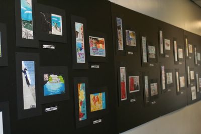
Our second project in Advertising was too create two coordinating travel ads. The whole classe's travel ads now hang in the back hallway.
I of course, I ended up doing my favorite city - Paris! Each ad had a black and white photo of a couple in front of the Eiffel Tower. I drew a red passport stamp that layers over the photo. The one on the left reads, "Not an average lunch out: Fall 2006" and the one on the right, "Not an average walk in the park: Fall 2006". Then in the red area it says, "Paris: experience the Romance." Click on the photo if you would like to see if larger!
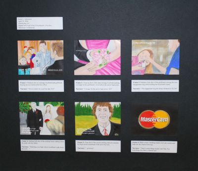
The last project in my Advertising class was to create a six panel Mastercard: Priceless Commercial. My commercial was titled Highschool Sweethearts: Priceless.
Panel One: Movie tickets for your first date: $12
Panel Two: Corsage for the senior high prom: $25
Panel Three: The engagement ring she's always dreamed of: $3,700
Panel Four: Watching your high school sweetheart walk down the aisle:
Panel Five: Watching your high school sweetheart walk down the aisle: Priceless
Panel Six: (Wedding bands swirl together to form the Mastercard logo) There's some things money can't buy; for everything else there's Mastercard.
If you want to see more detail just click on the photo and you should be able to read it!
That's it for now! I'll show you more projects as I get into my computer classes. Thanks so much for looking!
Monday, May 29, 2006
Tour of School
Subscribe to:
Post Comments (Atom)


8 comments:
Kayla...I've been wondering what you've been up to. You've done outstanding design work...and I loved how you displayed each project. COngrats on your first year. Thanks for updating us! deB ;-)
Kayla...you are so talented! LOVE each piece that you have created!!
WOW Kayla- fantastic work!!! Looks like you have been busy busy busy!!!
KAYLA!!!! Fantabulous as always! Keep up the good work and blow everybody's socks off!!!
: )
Wow, Kayla! Totally amazing! You do incredible work!
Kayla I love all of your work! What talent!!!
Hey Kayla,
All your projects look great! Congratulations on your accomplishments.
Blessings,
Mel
So fun to see your behind the scenes stuff kayla! ;) And what amazing work you do! WOW...keep it up! ;)
Post a Comment